
Learn how to add a wordpress pricing table with toggle in Gutenberg. Compare methods, default billing states, accessibility, and conversion best practices.
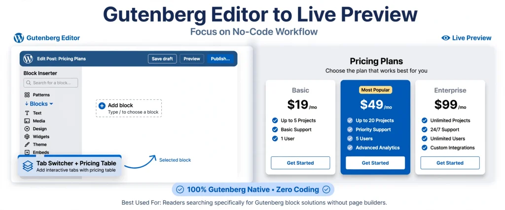
When prospective customers visit your website’s pricing section, they make fast decisions about whether your product or service fits their budget. Forcing visitors to calculate annual discounts manually or navigate across separate pages creates friction that hurts conversions. Learning how to set up a wordpress pricing table with toggle enables buyers to compare monthly and annual subscription rates with a single click. In this guide, you will learn the primary implementation methods, design psychology, accessibility requirements, and a step-by-step Gutenberg workflow to build a fast-loading pricing toggle.
What Is a Pricing Toggle and When Should You Use One?
A pricing toggle-also referred to as a billing switch or billing cadence toggle-is an interactive control positioned directly above a pricing grid. It enables website visitors to switch the displayed plan rates between different payment schedules, typically monthly and yearly billing cycles.
Incorporating a billing switch keeps your page layout clean and compact while clarifying recurring subscription options. Instead of cluttering your page with redundant side-by-side tables, a toggle presents your pricing tiers clearly without overwhelming the user.
Primary Use Cases for Pricing Toggles:
SaaS & Digital Software: Highlighting lower monthly-equivalent pricing on annual plans to incentivize long-term subscriber retention.
Membership Sites & Online Courses: Offering students or members a substantial discount when committing to an annual membership upfront.
Agency Retainers & Consulting Services: Demonstrating the clear cost savings of discounted annual service agreements over flexible month-to-month retainers.
Woo-Commerce Subscriptions: Presenting recurring billing tiers and bulk purchase savings clearly for subscription-based store products.
Comparing 3 Ways to Build a WordPress Pricing Table with Toggle:
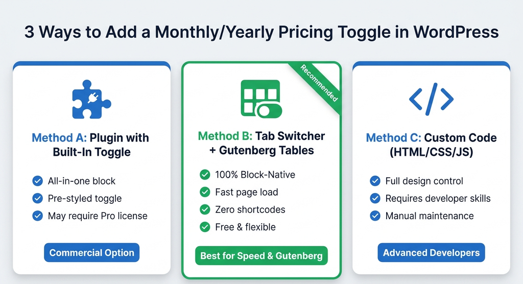
Website owners generally rely on one of three methods to implement a billing toggle in WordPress. Each approach offers distinct advantages depending on your technical requirements and site speed priorities.
| Method | Technical Approach | Key Advantages | Potential Disadvantages | Ideal Audience |
| Method A: Plugin with Built-In Toggle | Installing a dedicated pricing plugin with native toggle controls built into its settings (e.g., RioVizual, Pricing Table by Supsystic Pro, Tableberg Pro, ARPrice Pro, or Easy Pricing Tables Pro). | Single-block configuration; toggle styling and animation are pre-configured. | Often requires a paid Pro license or introduces third-party page builder dependencies. | Site owners looking for a commercial plugin with pre-built toggle controls. |
| Method B: Switcher/Tabs Block + Block Tables | Nesting lightweight pricing table blocks inside a Gutenberg-compatible tab switcher container block. | 100% block-native, zero shortcodes, fast page speed, clean HTML output, flexible styling. | Requires setting up two separate pricing table blocks (one for monthly, one for yearly). | Site owners, freelancers, and agencies prioritizing site performance and Gutenberg efficiency. |
| Method C: Custom HTML, CSS & JavaScript | Hand-coding custom HTML table structures with custom CSS styling and JavaScript event listeners. | Complete control over markup and design without plugin overhead. | Requires web development expertise and ongoing maintenance when theme styles update. | Developers building bespoke custom themes from scratch. |
Honest Fact Check on WBD Pricing Tables:
Our plugin, WBD Pricing Tables by WPBrand Digital, is a free, block-native plugin for the WordPress Block Editor. It provides dedicated Pricing Table and Comparison Pricing Table blocks with customizable column layouts, feature checkmark lists, featured plan badges, and custom CTA button controls.
It is important to be clear: WBD Pricing Tables does not feature a built-in toggle switch inside its block settings panel. Instead, you achieve a billing toggle using
Method B: creating a monthly WBD Pricing Table block and a yearly WBD Pricing Table block, then nesting them inside a Gutenberg tab switcher block. This method gives you complete design control while keeping your site fast and short code-free.
Step-by-Step Tutorial: How to Build a WordPress Pricing Table with Toggle
Follow this numbered tutorial to build a responsive, toggle-enabled pricing grid in the WordPress Block Editor using WBD Pricing Tables inside a Gutenberg tab switcher.
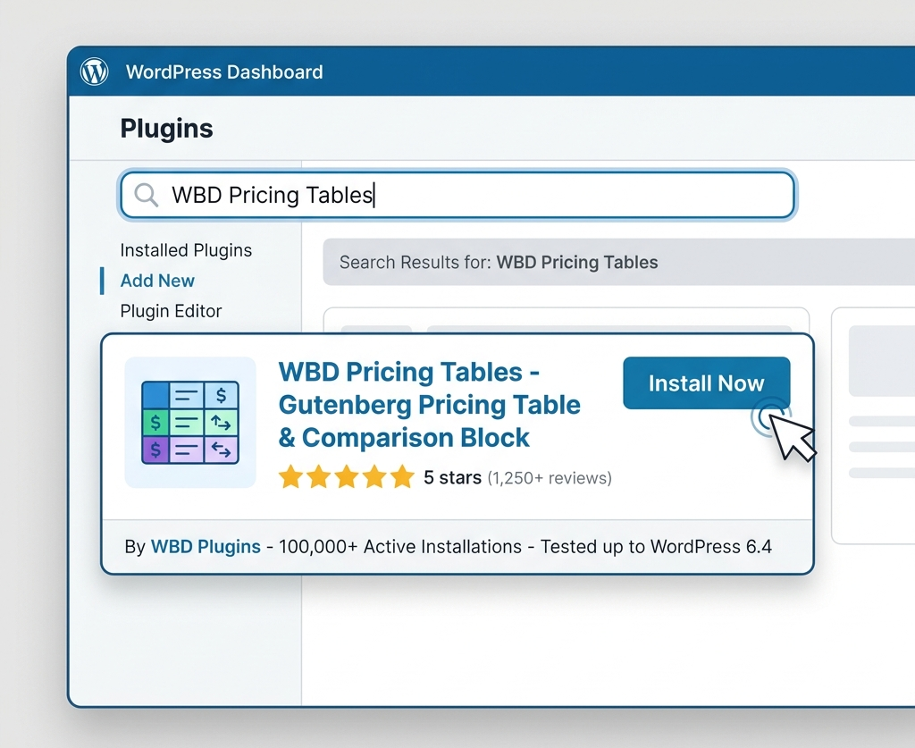
Step 1: Install WBD Pricing Tables
- Open your WordPress Admin Dashboard and navigate to Plugins → Add New.
- Search for “WBD Pricing Tables”.
- Click Install Now and then Activate.
(If you are searching for a reliable pricing table wordpress plugin free option, WBD Pricing Tables delivers responsive 1 to 4 column layouts without extra bloat).
Step 2: Create the Monthly Pricing Table Block
- Open your target page in the Gutenberg Block Editor and click the + Block Inserter.
- Add the WBD Pricing Table block to your layout.
- Select your column structure (e.g., 3 columns) in the Block Inspector sidebar.
- Enter buyer-centric plan titles (Starter, Professional, Enterprise), baseline monthly prices (e.g., $19), currency symbols ($), and monthly billing terms (/month).
- Add feature bullet points using checkmark (✔) icons for included features and cross (✖) icons for excluded items.
- Configure Call-to-Action (CTA) button labels (e.g., “Start Free Trial”) and set the checkout destination links for your monthly plans.
Step 3: Create the Yearly Pricing Table Block
- Duplicate your monthly WBD Pricing Table block or insert a second block directly below it.
- Adjust the displayed prices to show the discounted annual monthly-equivalent rates (e.g., $15 instead of $19).
- Add clear billing descriptions directly under each price (e.g., “Billed $180 annually”).
- Update the CTA button URLs so yearly buttons direct buyers straight to annual checkout links or annual subscription price IDs.
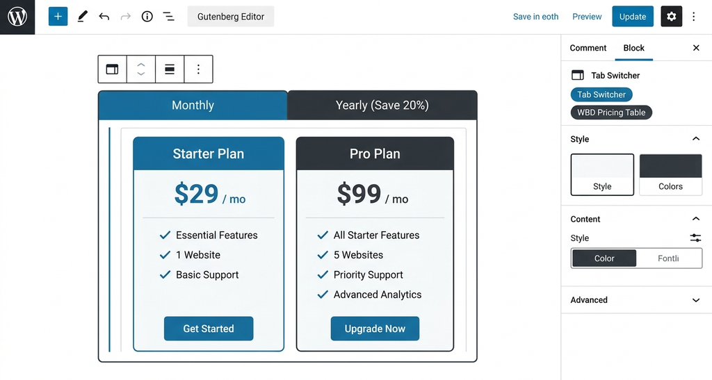
Step 4: Nest Blocks Inside a Gutenberg Switcher Container
- Insert a Gutenberg-compatible switcher, toggle, or tabs container block into your editor.
- Move your Monthly WBD Pricing Table block into Tab 1 (labeled “Monthly”).
- Move your Yearly WBD Pricing Table block into Tab 2 (labeled “Yearly” or “Annual”).
- Add a high-contrast savings badge to the yearly toggle tab (e.g., “Save 20%”).
Step 5: Set Default State and Test Functionality
- Select your preferred default active tab (Monthly or Yearly) in the container block settings.
- Preview your published page on desktop, tablet, and mobile screens to verify that switching tabs updates the displayed plans smoothly and accurately.
Selecting the Default State: Monthly vs. Yearly Billing
Deciding whether your pricing page should load on monthly or annual billing by default is a strategic choice. Both options offer distinct conversion advantages.
The Case for Annual Defaults
Loading your page with annual pricing active presents lower monthly-equivalent rates immediately. This strategy utilizes price anchoring, where the first number a visitor sees establishes their perception of value.
- Best For: B2B platforms, enterprise tools, and products purchased by teams with yearly budgets.
- Industry Research: Conversion optimization platform EyeCaptain notes that defaulting to annual billing can increase revenue per visitor when buyers expect annual contracts. Furthermore, Harvard Business Review data on consumer choice highlights the 66-23-11 rule, showing that approximately 66% of buyers choose the middle plan when presented with three balanced options. Research from McKinsey & Company also indicates that clear plan packaging can raise business profits by up to 6%.
The Case for Monthly Defaults
Loading monthly pricing first provides complete transparency without upfront commitment pressure.
- Best For: B2C products, solo creators, lower-cost tools, or services offering a free trial.
- Risk Avoidance: Displaying monthly rates first prevents buyer shock at checkout, where a customer might feel surprised by a single large annual charge.
Recommendation: Test Your Audience
Instead of assuming which default works best, conduct an A/B test. Measure metric indicators such as Revenue Per Visitor (RPV) and initial refund rates rather than short-term click-through counts alone. (Note: RingCentral reported in an A/B test that reducing pricing plans from four to three increased conversions by over 37%).
Displaying Prices Without Buyer Confusion
Ambiguous pricing creates friction and causes buyers to abandon their carts. Follow these formatting guidelines to make your pricing transparent:
- Separate Billing Period from Price Unit: Display the monthly-equivalent rate in large typography (e.g., $15 / month), followed by a clear billing line directly underneath (e.g., “Billed $180 annually”).
- State Savings Explicitly: Combine percentage badges on the toggle (e.g., “Save 20%”) with dollar amounts on individual plan cards (e.g., “Save $48 a year”). Concrete dollar savings are easier for buyers to evaluate mentally.
- Use Honest Reference Pricing: If you display crossed-out strikethrough rates (e.g.,
$19$15), ensure the reference price reflects the actual month-to-month price charged.
Aligning CTA Buttons and Checkout Links
A common conversion breakdown occurs when a visitor toggles to yearly billing, clicks “Get Started,” and gets sent to a monthly checkout page.
To prevent lost sales and payment errors:
- Assign Unique Checkout URLs: Ensure the CTA buttons in your monthly block link to monthly checkout pages, and the buttons in your yearly block link to annual checkout products.
- Differentiate CTA Language by Plan Tier: Match your button text to the commitment level of each plan:
- Entry/Free Tier: Use low-friction text like “Start Free Trial” or “Try for Free”.
- Main Paid Tier: Use action-oriented copy like “Get Started Now” or “Upgrade to Pro”.
- Enterprise Tier: Use clear contact phrasing like “Talk to Sales” or “Request a Demo”.
Mobile UX Guidelines:
- Touch-Friendly Toggle Targets: Ensure toggle switches have a minimum tap area of 44×44 pixels with sufficient spacing so mobile users do not misclick.
- Vertical Card Stacking: Horizontal columns should collapse into vertically stacked cards on mobile devices.
- Sticky Comparison Headers: If you use a comparison table plugin wordpress block below your main cards to show multi-row feature comparisons, ensure table headers or plan labels remain visible while scrolling.
Web Accessibility Standards for Pricing Toggles
Making your pricing table accessible ensures all visitors-including those using screen readers or keyboard navigation-can evaluate your plans seamlessly.
- Semantic HTML Elements: Ensure your toggle control uses real HTML <button> or form elements with aria-pressed=”true” or aria-checked=”true” attributes to communicate active states to assistive technologies.
- Keyboard Focus Indicators: Allow users to tab logically through the toggle switch, plan cards, and CTA buttons. Never remove the browser’s visible focus outline without providing a distinct custom focus style.
- Color Contrast Requirements: Maintain a minimum contrast ratio of 4.5:1 for all text against card backgrounds. Avoid relying on color alone to indicate active toggle states; combine color changes with bold text, background fills, or visual borders.
Page Speed Performance and SEO Considerations
Fast-loading pages rank higher in search results and convert more visitors.
- Avoid Script-Heavy Plugins: Select block-native options that generate clean HTML markup rather than loading external JavaScript libraries or heavy CSS files.
- Keep Both States Crawlable: When nesting monthly and yearly blocks inside a tab switcher, ensure both tables exist in the DOM markup so search engines can crawl and index your complete pricing details.
- Structured Data Schema: Where applicable, add JSON-LD Offer or AggregateOffer schema to help search engines present accurate price points in rich search snippets.
Common Pricing Toggle Mistakes and How to Fix Them
- Broken Toggle Script: The switch fails to swap tables due to script minification conflicts. Fix: Use native Gutenberg tab container blocks and verify block nesting.
- Hidden Annual Terms: Displaying a low monthly rate without stating that it requires a full 12-month payment. Fix: Add clear “Billed $X yearly” micro-copy under the price.
- Mismatched Checkout Destinations: Annual toggle buttons directing users to monthly checkout links. Fix: Audit CTA destination URLs across both block variations before publishing.
- Unresponsive Mobile Layouts: Grids bleeding off mobile screens horizontally. Fix: Ensure your block settings enable automatic single-column card stacking on mobile views.
- Excessive Plan Options: Displaying 5 or 6 plans simultaneously, causing analysis paralysis. Fix: Limit your grid to 3 or 4 clear tiers.
Real-World Example Scenario: 3-Plan SaaS Pricing Setup
Below is an example of a standard 3-tier SaaS pricing model featuring a 20% annual discount structure:
| Plan Name | Buyer Persona | Monthly Rate | Yearly Rate (20% Discount) | Annual Billing Total | Recommended CTA Copy |
| Starter | Solo creators & freelancers | $15 / month | $12 / month | $144 / year | “Start Free Trial” |
| Pro (Featured) | Growing teams & businesses | $49 / month | $39 / month | $468 / year | “Get Started Now” |
| Business | Large organizations & agencies | $99 / month | $79 / month | $948 / year | “Talk to Sales” |
In this configuration, WBD Pricing Tables applies a “Recommended“ badge and highlighted border to the Pro plan, while the tab container displays a “Save 20%” badge on the annual toggle option
Frequently Asked Questions (FAQ)
Can I add a monthly/yearly toggle without coding?
Yes. You can create a toggle-enabled pricing section without coding by inserting a Gutenberg tab switcher block and placing a monthly pricing table block in Tab 1 and a yearly pricing table block in Tab 2.
Should the toggle default to yearly billing?
Default to yearly billing if your target buyers are businesses or teams with annual budgets. Default to monthly billing if your customers are individual consumers, solo creators, or users signing up for a free trial.
How do I make the buttons change with the toggle?
When using the nested block method, you configure separate Call-to-Action buttons inside your monthly block and your yearly block. When visitors switch tabs, the entire block-including its CTA links-updates automatically.
Is a pricing toggle bad for SEO or accessibility?
Not when implemented correctly. Using native Gutenberg tab blocks keeps both pricing tables in the HTML DOM for search engine crawlers, while semantic button markup and ARIA attributes maintain screen reader compatibility.
Can I use a toggle with WooCommerce?
Yes. You can link CTA buttons in your monthly pricing block to monthly WooCommerce subscription products, and link buttons in your yearly block to annual WooCommerce subscription products.
How many plans should I show in a pricing table?
Showing 3 or 4 plans is ideal. Presenting more than 4 plans can overwhelm visitors and cause decision fatigue, leading to lower overall conversion rates.
Adding a wordpress pricing table with toggle empowers your site visitors to evaluate payment options clearly and select the subscription term that best fits their budget. By combining lightweight Gutenberg blocks like WBD Pricing Tables with a tab switcher container, you can publish fast, accessible, and high-converting pricing layouts in minutes.
👉 Download WBD Pricing Tables Free on WordPress.org
👉 Explore web design tools at WPBrand Digital


Leave a Reply